The #1 reason for your CLS score rise
By Asaf Shamly | July 13, 2021

Let me walk you through a (not so) hypothetical situation:
You’re reading this amazing piece of content.
Every sentence is pure GOLD.
The author drives the point home with such conviction that you just sit there, wondering:
“How in the world did it take me so long to stumble upon this blog?”
You’re hungry for more.
Just as you’re about to press the “read more” button, the page layout slightly shifts, and you end up clicking on an ad to buy virtual diamonds, an in-game currency for a Clash Royale ripoff.
You don’t even play Clash Royale, let alone a ripoff!
And just like that, your mood shifts from amazement into sheer annoyance.

Annoyance galore
The page that sells these “diamonds” takes forever to load. It’s flashing and shifting around and now you need to wait for your original page to load back again so that you can finally press that “read more” button you wanted to, before being so rudely interrupted.
You’re no longer *that* excited about the site and its content, as the experience wasn’t exactly delightful.
You even feel deceived a bit for giving that publisher an ad click when they clearly didn’t deserve it.
As I said, this is not exactly a hypothetical situation. It happens to a lot of folks, all the time.
It happened to me just recently, as well. I’m not gonna name any names, though.
But it inspired me to put pen to paper (finger to keyboard, I suppose) and explain why these accidental clicks happen; why – for you as a publisher – it’s important they don’t happen (for now let’s just say it’s a much bigger problem than just being an annoyance, and improvement to your Google rankings is in question); and the cool part: what you can do about it.
P.S. I’ve also written a full ebook on the topic (yes, I’m obsessed with fighting CLS, pick your battles they say!), you can download your free ebook here.
Why layout shifts happen
Most content management systems nowadays are super fast, and whatever content they serve (as long as it’s relatively lightweight), loads almost instantly, when a visitor opens the page.
Anything else that loads afterward could shift and move the content around the page.
In a nutshell, that’s how layout shifts happen.
To control them – the publisher needs to control EVERYTHING that loads on a page.
I know what you’re thinking – we’re all thinking the same thing.
You can’t control all of the content on your site like that. Not without HEAVY compromises, ones which most publishers aren’t that eager to make. Those can hurt their bottom line, and publishers can’t have that.
You guessed it – ads are the number one culprit of shifting layouts, due to their unpredictable nature.
Different users come to your site with different internet speeds.
They use different devices, different browsers.
There are countless other factors that affect the time it takes to load the ad on the page.
To make the problem even worse – you can never know for sure what creative comes in through the ad server.
Maybe it’s of a different size. Maybe it E X P A N D S on hover.
It’s hardly the end of the world, though. There are certain things and industry hacks/best practices you can do to keep these shifts to a minimum. But before I get to those, here’s why you should stop layout shifts:
Why layout shifts are a BIG deal
Let’s just start by saying that layout shifts are annoying, and annoyances hurt the user experience (UX).
Now let’s consider Google a bit.
The number one goal for the search engine apex predator is to constantly improve the user experience and to be unmatched in that respect.
That doesn’t mean just displaying the *right* links on the first few SERPs, because we’ve come to the point where multiple sites are capable of presenting the right information.
It also means displaying the sites that offer the best UX themselves – first.
So if Google wants to improve the user experience, and offer the best UX possible – the sites it lists on the top of its SERPs need to offer the best UX, as well.
To properly understand which sites offer the best UX for their visitors, Google came up with a new set of metrics and signals – Core Web Vitals. This dramatic update started rolling out on June 15th and is expected to kick into full gear by the end of August.
The impact on your rankings? inevitable.
One of the key metrics to pay close attention to is Cumulative Layout Shift, or CLS.
It works like this: Google tracks all the different layout shifts (horizontal or vertical, for example), and assigns a score for each one. The CLS represents the sum of all different layout shift scores, calculated for every unexpected layout shift that happens in a single page’s life.
So if you want to rank high on Google’s search result pages, you need to play by Google’s UX rules and fix your CLS scores!
Here’s how you calculate your CLS score:
layout shift score = impact fraction X distance fraction
…with impact fraction being the portion of the screen that’s impacted by the movement of the content, and distance fraction being the greatest possible distance the content can move, relative to the viewport, in the frame.
For example, if a piece of content that takes up half of the screen’s real estate (50%) shifts halfway across the screen (25%), it impacts a total of 75% of the screen, and is, as such, measured at 0.75.
Given that it moved 25% of the viewport, its distance fraction is 0.25.
The total layout shift score in this example is 0.75*0.25=0.1875.
For Google, anything under 0.1 is considered good. Anything above 0.1 should be tweaked.
What you can do to keep layout shifts under control
There are a lot of different ways to keep your layout shifts within the accepted range.
All can improve CLS scores to an extent, and all demand a sacrifice so choose wisely.
1. Play it safe with hard-coded, single-sized ads.
Create placeholders above the fold, this way you can make sure to know, well in advance, how everything will look once the ad loads.
This is a foolproof solution but that means limiting yourself to just one size per ad slot.
If you have a campaign that needs to deliver a bigger size, or if you have programmatic demand, you’ll be missing out big time.
At the end of the day, multiple sizes guarantee higher revenue, and unless you’re sitting on piles of cash, you don’t want to be cutting corners there.
2. Deploy lazy loading.
Lazy loading can improve the user experience by only loading the ads when the placeholder is (almost) within the viewport.
However, lazy loading never considers user behavior. If they scroll relatively fast, past the placeholder (if the article is image-heavy or is a gallery), the ad will load too late and still shift the content.
Or, it won’t load at all and you’ll end up with low viewability and low CPMs.
3. Try to improve page latency and/or add more sticky units.
This is a great solution in theory but as you probably already know, improving page latency can turn out to be a super difficult task, particularly from a technical point of view.
4. Use real-time behavioral data.
More forward-thinking publishers will use an advanced hack that leverages real-time data.
Essentially, personalizing your ad layout based on the user behavior can bring down site latency, and generate more income without antagonizing the audience in the process. The downside here is that it can only be done with the help of artificial intelligence (AI).
Future reading
Very few publishers can survive without displaying ads on their sites and without an organic audience to consume their content. But if these ads hurt the user experience by shifting content around, publishers won’t have any organic audience to consume their content in the first place.
Publishers need to do all they can and leverage all the tools at their disposal to be able to display as many ads as possible without hurting the UX. Luckily enough, powerful AI-based solutions are available, helping publishers achieve just that.
Some trendsetters are already paving a new road for themselves and turning heads as they do.
I’ve outlined advanced tactics, as well as more well-established hacks and tips, in my recent ebook, “What product teams need to know about CLS and their ad inventory”, so make sure you give it a read here.
Latest Articles
-

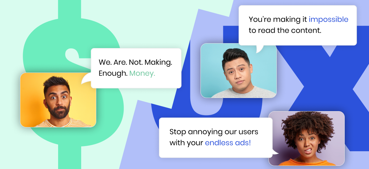
Do NOT make me choose between a great UX and boosting my revenue!!
The ongoing clashes between revenue, product, and editorial teams are painful to say the least. It doesn’t have to be this way.
View Now -

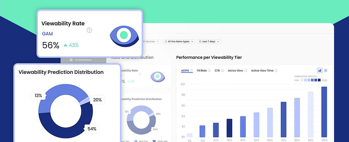
Your Brand New Viewability Dashboard!
Understand your inventory breakdown with the new Viewability Dashboard.
View Now -

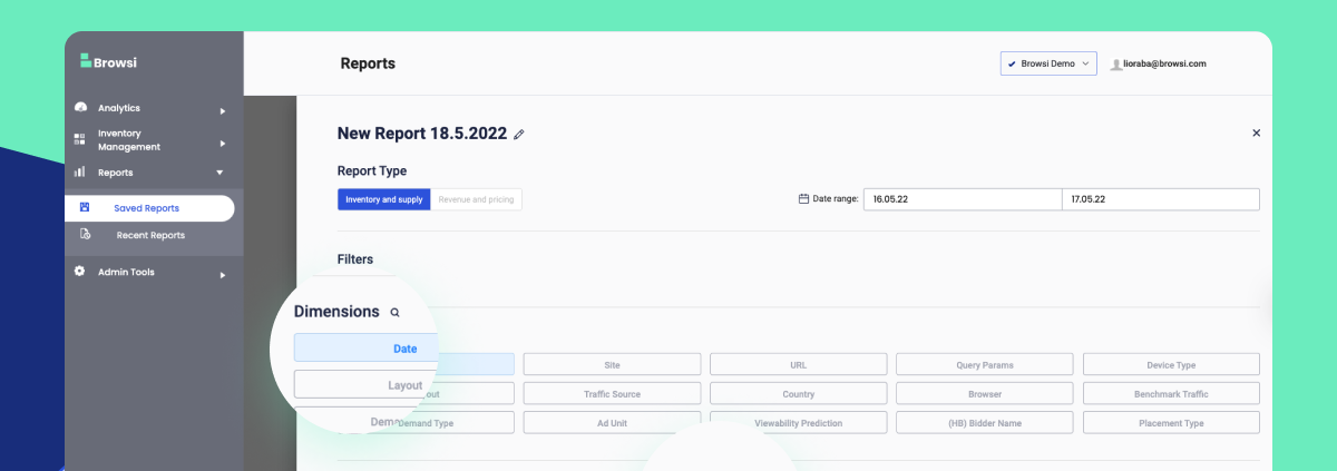
Maximize Your UX & Revenue Data With Personalized Reports
Ready to uncover insights and step up your ad layout strategy?
View Now

