Do NOT make me choose between a great UX and boosting my revenue!!
By Asaf Shamly | October 19, 2022

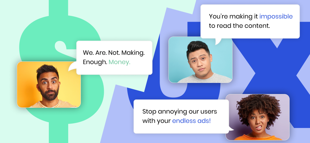
– We. Are. Not. Making. Enough. Money.
– Stop annoying our users with your endless ads!
– You’re making it impossible to read the content.
The ongoing clashes between revenue, product, and editorial teams are painful to say the least…
Publishers are constantly pushed into corners.
On one end are the revenue teams and their obvious need and desire to create well – revenue. To do that, they need ads, as many as possible.
On the other end are the product and editorial team trying to create the best possible user experience. Ads typically interfere with that. Visitors generally perceive ads as a necessary evil but even in that case – their tolerance levels can be quite low.
Visitors dislike most ads, most of the time, and that’s putting it mildly.
So, how do publishers typically balance this conflict?
The short answer? Not well.
The fact that we’re still here, in 2021, discussing ads and their effects on the user experience is evidence enough (as if 10 million users downloading ad blockers on Chrome alone wasn’t enough).
What they do is compromise.
And workarounds.
Dozens of workarounds.
All with the goal of delivering a premium ad inventory, hopefully without upsetting users too much.
A premium ad inventory – one that doesn’t get in the way of the content, one that’s relevant to the visitor and plays well with their devices, connectivity, and multiple other variables.
So they try a/b testing. And they try better selling into viewable inventory.
Some employ in-view ad refresh or tackle the site speed.
Others work tirelessly on overcoming sophisticated bid shading algorithms.
Do you know what all of these methods (and countless others) have in common?
They don’t truly achieve synergy across all departments. Something always has to give.
The worst part is that most of these things usually move the needle ever so slightly, if at all.
What’s more, publishers now need to keep an eye out for Google, as well.
The search engine giant, laser-focused on providing its own visitors with a supreme UX, started tracking the UX provided by other publishers. It does this through Core Web Vitals, a newly introduced set of metrics that track the behavior of different websites.
If Google deems your site’s UX as bad, well guess what?
You’re going down on the SERPs.
Let me tell you about the loophole in the matrix – ads and UX don’t have to be on conflicting sides.
If all of this feels like pushing a 1.5-ton car up the street, that’s because – it’s exactly like that.
So how do you get behind the wheel and actually drive this thing? How do you increase your revenue without damaging your UX?
By personalizing your ad layout using real-time behavioral data.
Leading publishers leverage hundreds of anonymized data points to gain key insights into the behavior of their visitors, as well as many important technicalities.
This data ranges from browsing habits (scroll speed, mouse movements, stuff like that), to technicalities like browsing on a smartphone, their internet connection’s speed, their device’s speed, location, etc.
Such information is used to personalize the ad layout for each individual visitor.
In those few milliseconds between a visitor coming to a site and the site actually loading, all of this data is gathered, analyzed, and acted upon.
The result is a completely personalized ad experience, which includes the best ad positions, best ad sizes, best moment to load the ad during browsing, and a myriad of other bests.
The logic behind it is stupidly simple – a personalized ad layout, one which adapts to the browsing habits of each individual user, improves the overall user experience.
Some people scroll faster and just skim through the content (particularly true for image-heavy content). Others like to take their time. Some browse on smartphones, and have limited real estate to consume content on. Others use a 27-inch monster of a screen.
By adapting the ad layout to all these different variables, viewability rates go up, while the UX stays intact. The ads never get in the way and never shift the content around. They blend ideally.
And eeeverybody loves high viewability rates. It makes selling ad positions a lot easier (and more lucrative!).
It eliminates the need to make the impossible choice between either revenue, or UX, and instead gives publishers the best of both worlds.
Easy right? Just collect a bunch of data points and you’re good to go 🙂
Obviously, there’s no chance in hell that a human being would be able to analyze all that data and create a personalized ad layout alone – not a problem. Artificial Intelligence does that, instead.
Not only does it work, but it’s showing some pretty impressive numbers, as well.
Recently, a leading US publisher deployed this to create a personalized ad inventory for its visitors, and we observed the impact for an entire day.
The results were jaw-dropping:
Performance metrics
- The number of ads per page went up by 11%
- Viewability increased to 80% – a 38% increase!
- Invalid traffic (IVT) went down by 55%
UX metrics
- Average scroll depth went up by 6%
- Average scroll velocity decreased by 38%
- Average time on page remained intact
In the middle of difficulty lies opportunity (not me – Albert Einstein).
For once, synergy was achieved throughout all of the publishers’ conflicting departments.
No more Sophie’s choice.
Digital media has been around for decades, and the ad layout overhaul is long overdue. With the proliferation of Artificial Intelligence, not only are publishers able to achieve things inconceivable just a decade ago, but they’re able to create an environment in which everyone’s happy.
It’s a win-win-win situation!
Happy consumers ✔️
With personalized ad layouts, consumers are getting the content they want, followed by ads that they find unintrusive, contextual and relevant. That makes them happy, and when they’re happy…
Happy publishers ✔️
Publishers are also happy knowing they delivered a premium user experience and maximized their ad revenue.
Happy advertisers ✔️
Even the advertisers, which I haven’t even mentioned in this post, can be happy, as with personalized ad layouts, viewability goes up and invalid traffic goes down.
All it takes is a little data and a little Artificial Intelligence. After that, the “car” basically drives itself.
Oh! Did I mention we can help you make all of this a reality? 😉
To learn more on how YOU can gain control of your digital real-estate, increasing your revenue while improving your UX, download the full report here.
Latest Articles
-

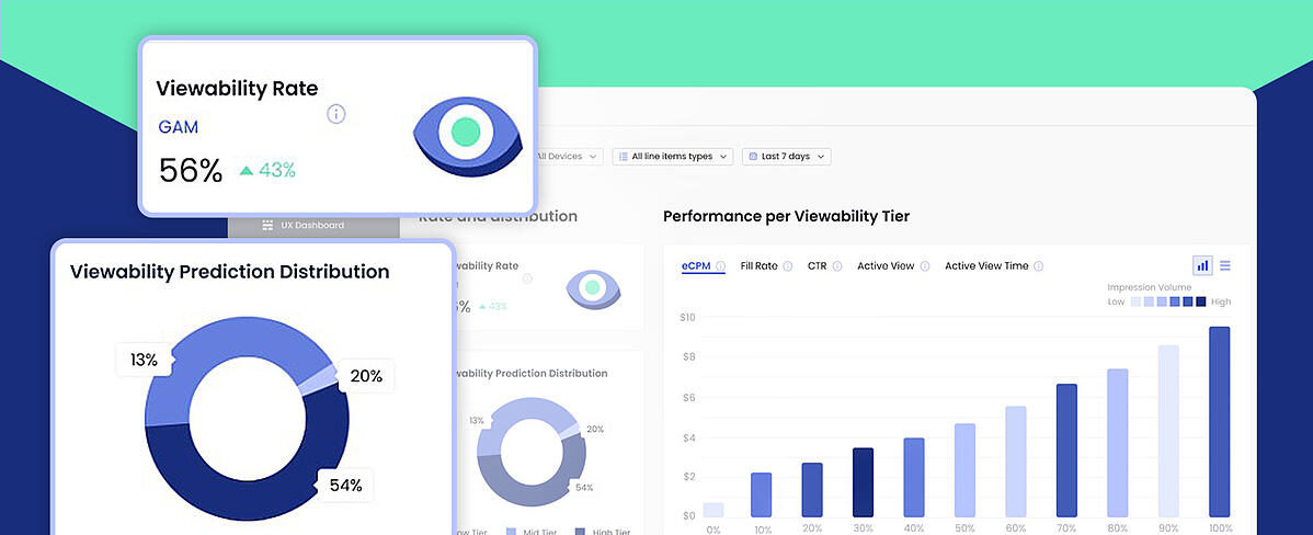
Your Brand New Viewability Dashboard!
Understand your inventory breakdown with the new Viewability Dashboard.
View Now -

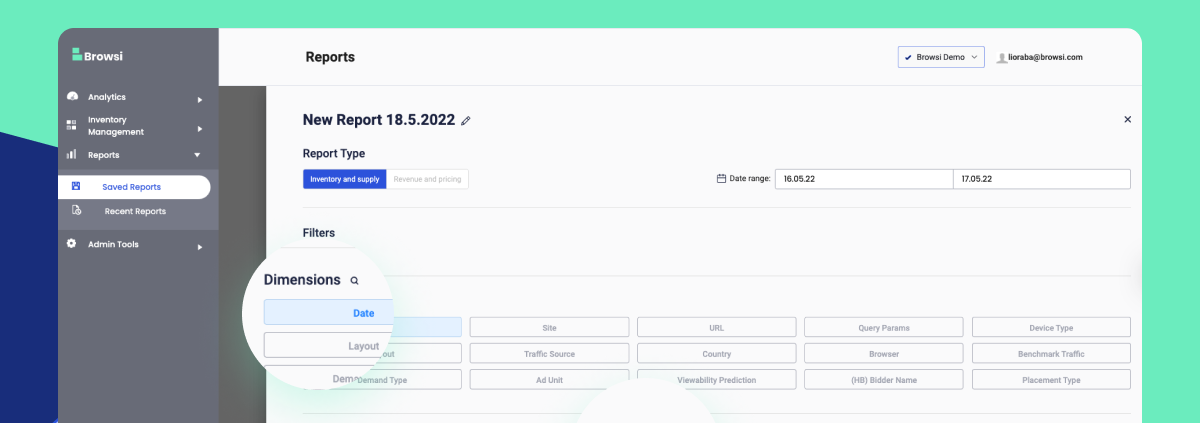
Maximize Your UX & Revenue Data With Personalized Reports
Ready to uncover insights and step up your ad layout strategy?
View Now -

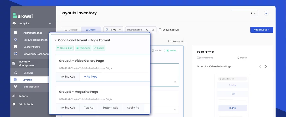
Tailor your users’ ad experience with CONDITIONAL LAYOUTS
Customize your website’s ad layouts, based on ANY conditional scenario, by using real time page parameters and user data.
View Now
