9 Ways Content Structure Can Maximize Ad Inventory Performance
By Asaf Shamly | January 28, 2021

The legendary media mogul Sumner Redstone famously coined the phrase, “Content is king,” by which he meant that the content itself would always be more important than the channel or platform on which it’s distributed – whether it’s radio, television, movies, magazines/newspapers, and now the internet. In other words, if the content doesn’t engage an audience, the distribution channel won’t matter.
The way people consume content has drastically changed in the 20-plus years since Redstone told us that content is king, mainly because there is now so much content competing for our time – and the internet was still in its infancy as an important channel to distribute content and information when Redstone coined his famous dictum back in the ‘90s. This means that publishers must deal with an audience whose attention span is lower than it’s ever been, rendering textual content less effective.
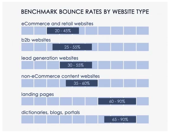
The high bounce rates as seen on a blog (65%-90%) or a landing page (69%-90%) of a non-commerce website clearly demonstrate the need for publishers to create content that will increase user engagement, which will help them optimize their second most important asset after their content – the ad inventory.
However, there are strategies that publishers can take to create an optimal structure that can help increase content engagement, and the viewability, scale and CPMs for their ad inventory. Here are 9 steps to take.
1. Aim for Shorter Paragraphs
Anyone who creates content for a living will tell you that writing longer articles is always easier than writing shorter. With a longer piece, you have more room to include facts, data, anecdotes, background info and other relevant content; with a shorter piece, you have to cram as much of this aforementioned stuff into a smaller space – while also knowing when to leave out any content that isn’t critical to the point you’re trying to make.
The sweet spot for publishers to aim for is keeping the user on an article for about 1.5-2 minutes; once you go past that range, the likelihood of a user staying on a page to read a second article drops. Keeping in mind the short attention spans of an average user, one of the best things to do is to simply shorten the paragraphs.
This gives you two things that help increase the number of ads:
- Ads can only come in between paragraphs/elements, never inside a paragraph. So, if you create more paragraphs you have more options for ads.
- Users can stay longer on the site, scrolling more, as they have more paragraphs to go through. You keep them interested in what you write.
2. With Font Size, Bigger is Better
If you only have 2 paragraphs on a page (even if the page is 5,000 px), you will have the opportunity to place 2 ads on that page max; but if that same content was structured across six paragraphs, you have a chance to include 7-8 ads on the page.
One of the key tricks you can use to restructure your content to include more ads is to increase the font size of your text. This might sound obvious, but it’s important to understand how this can significantly affect the way in which users are interacting with a page:
- If you increase the size by just a few pixels, you can have much longer pages, which naturally increases the number of ads you can have on a page.
- Users love to scroll; in this age of Instagram, Twitter and Facebook, it has become second nature to how people engage with content. They want to quickly view one piece of content and move onto the next. By increasing the font, you increase the chances that they will stay on a page in order to keep scrolling and reading more.
3. A Picture is Worth a Thousand Words
Well, in theory a picture can be worth a thousand words. Images are obviously a great way to engage with users, but there are some important considerations to take into account when using images for content engagement:
- Make sure that the images are actually engaging; if your site is overstuffed with page after page of boring, repetitive stock images, users are not going to stick around for very long.
- Think about adding elements that keep a user on an image, such as captions and titles that add some insight into the image.
- Think about social media: Allow a way for users to share an image (where possible) that can expand the reach of your content.
4. Learning to Share
If you are publishing engaging content – and your traffic numbers can easily confirm that this is the case – there’s no reason to keep it to yourself. As mentioned already, it’s important to think about content engagement beyond just the page and think about how it can also engage with people on social media.
Utilizing social media widgets and icons can help keep users interacting with the content on the page. This could mean adding relevant tweets which not only grab the attention of a user and can keep them on the page, but it can also add length to an article.
Another way to think about utilizing widgets in your content is to think about what Medium does: When you read any article on Medium, you can highlight a portion of the text and what pops up are widgets that allow you to highlight text, comment on the text and tweet that portion of the content. And so, when people go on Medium, they know they’ll be able to interact with the content, which can increase engagement and therefore the amount of time a user stays on the page.
5. Keep Your Users Happy
It should not be surprising that user engagement has a clear impact on ad revenue for publishers. What this means is that publishers have to always prioritize the user experience (UX) when it comes to the content that’s being published on your site, as well as the placement of your ads.
In fact, Tyler Bishop, a digital marketer and SEO veteran, notes that user engagement and digital ad revenue are not only “Inexorably tied,” but that “a user’s experience may do more to define the total revenue earned from a user session than just about any other factor at play in the publishing ecosystem.”
According to Bishop, the optimal user experience would be created by one that optimizes ad impressions by landing page and user behavior.
6. Leverage Personalized Ad Inventory
Bishop also believes that AI will benefit publishers by helping to create a better user experience that in turn can boost ad revenue. This is where dynamic ad placements, as Browsi provides, come into the picture.
One ad layout doesn’t fit all. There is no single uniform experience for everyone. Content is consumed in real-time and pages have different structures, varying levels of user engagement, and are shown on multiple types of devices with different internet connections. Therefore, it is important to create an ad inventory layout in real-time based on multiple data points.
Personalized ad inventory automatically adapts to user behavior, such as scroll depth, scroll velocity and dwell time, and to page’s structure, load time, image count and density, to name a few. This personalization is created by applying AI on top of multiple real-time data points, producing the highest combination of viewability, scale, and UX.
Source: Browsi
7. Make a List
BuzzFeed has been one of the most influential media companies leading the transformation in how we engage with information. Aiming at a younger, millennial audience, BuzzFeed and its founder Jonah Peretti recognized that their content was going to be consumed by people who came of age on the internet and had little patience (or attention span) for the sort of long articles that were common with print media like magazines and newspapers.
Central to BuzzFeed’s content engagement strategy has been the utilization of lists – or “listicles,” as they’ve come to be known in the BuzzFeed parlance. From a publisher’s perspective, lists have clear advantages: They allow for short paragraphs, they keep people scrolling, they give you room to include images and widgets – and all of these advantages keep users on the page.
8. Keep Them Guessing
Sticking with BuzzFeed here for a second, while their listicles have always been popular, there’s probably no feature they are better known for than their highly entertaining quizzes, which are arguably the most popular content on their site. BuzzFeed’s quizzes are a good example of what publishers should be looking to accomplish with their content:
- Include entertaining, playful features that can keep users on the site engaged. This can include trivia or quizzes or other game-like features that lets users interact with content. Even the New York Times has its famous crossword puzzle.
- Be careful where you place these elements. For instance, if you’re including trivia that relates to an article, place them at the end of the article so as not to risk losing user engagement once they’ve gotten through these features.
9. Two is Better than One
If you have one long article, think about whether there is a way to structure it into two shorter articles. For instance, if you have a piece that is 1,600 words, you could break it up into two articles that are roughly 800 words each.
The reason for this is, of course, obvious: Multiple articles – which means multiple pages – gives you more opportunities to sell ads on your site. However, the content of the article has to dictate whether it would make sense to break it up into two separate articles; if it would leave you with one strong article and one significantly weaker one, then it’s best to leave the article intact as one.
Conclusion
Publishers should approach the optimization of ad inventory as a fluid, continual process. It requires real-time tracking of user behavior, page structure and other data points. By utilizing personalization powered by AI to adapt to these changing factors, you can optimize your ad inventory and increase your viewability, scale and CPM rates.
Latest Articles
-
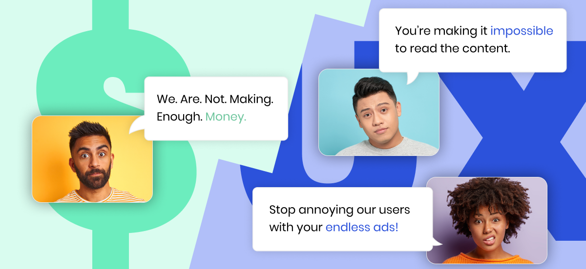
Do NOT make me choose between a great UX and boosting my revenue!!
The ongoing clashes between revenue, product, and editorial teams are painful to say the least. It doesn’t have to be this way.
View Now -
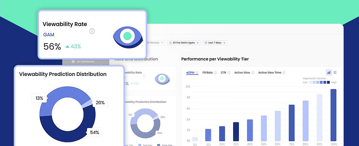
Your Brand New Viewability Dashboard!
Understand your inventory breakdown with the new Viewability Dashboard.
View Now -
Maximize Your UX & Revenue Data With Personalized Reports
Ready to uncover insights and step up your ad layout strategy?
View Now
