Google search index prioritizes mobile – what should you do about it?
By Asaf Shamly | January 28, 2021

In 2015, Google started experimenting with a mobile web only index. At the recent Pubcon event (October 2016), Google’s Gary Illyes, a webmaster trends analyst, announced that Google is done the experimenting. Within a few months, the company is planning on releasing a separate mobile web search index, which will become the primary Google Index. Currently, Google has a single index of documents available for search – desktop. This move is in response to the fact that the share of mobile searches continues to grow, and just last year, Google said that there are more searches now on mobile than on desktop. This means that mobile web has overtaken desktop as the most common search type. No exact time frames were given for the official launch of the mobile-first index, but it seems like an inevitable move, that will become official very soon.
Google will probably make an official announcement and will guide webmasters on how to prepare for the change. Until then, we have gathered a list of modifications that you should consider in order to be as ready as possible. Given the fact that a larger portion of the population uses their phones to access the Web, it’s vitally important for you to create a mobile compatible version of your website. Nowadays, if you don’t have a well suited mobile website, it won’t be long before your website falls off the radar and into the secondary pages of Google’s index. Thankfully, there are many ways to improve your website. Here are a few tips on how to prepare for this upcoming change and adjust your website to perfectly function as a mobile site.
Mobile Responsiveness
A responsive website means that the design, layout, and content are adapted and altered in correspondence to the various screen sizes that are currently available. Knowing how your website looks and performs on mobile devices is essential. Today, there are plenty of tools available that can be used to determine the performance and to test different designs and layouts. For example, Wirefy helps designers and developers create fast and manageable wireframes.
Load time: The amount of time it takes for a mobile website to load is crucial, especially if you wish to remain competitive in the online marketplace. If your website takes longer to load on mobile, you should start making changes to remove any unnecessary content and objects that further increase load times.
Mobile user experience: Over the past few years, Google has been spearheading projects and plans to improve the user experience. If you want a higher Google indexing rank, you should make sure your design is tailored to mobile.
Structured Data Testing
The structured data-testing tool from Google is a great resource. Structured data means highly organized types of data. When information is very structured and predictable, it is easier for search engines to organize and display it more creatively.
Structured data markup, is a text-based organization of data, that describes things on the web and served from the web. The text-based organization is included in a file. When providing structured data markup for content, you make it eligible for a variety of search features, as described in the Search Features & Experiences guide.
Testing Tools
Testing your website is becoming even more important with the rise of the multi-screen world. There are several great tools for checking the responsiveness and adaptiveness of your mobile website you can choose from such as mobiletest.me, Screenfly. Some tools can give a score and suggestions on how to fix the issues identified, based on the analysis. Google testing tool you can tell you if your site passes or fails the mobile test, you can see where you rank in Google search.
Get Your Website Listed on Google News
Google is putting a considerable amount of resources behind its news program. Getting listed on Google News is important for increasing your website’s exposure. To be added to Google news, Google suggests adding a Google News Sitemap to make the process easier. If your website is hosted on WordPress CMS, you can find Google News sitemap plugins in the WordPress repository. Once you’ve installed one of the plugins, you can apply to Google News here.
User Experience
User experience focuses on the understanding of user’s needs, values, behaviors, limitations and more. A website’s goal is to improve the quality of users’ interactions and engagement and to provide them with real value. Filling up your website with useless content and complicated funnels are bad. It won’t be long before your website begins to lose its ranking, especially if you have stuffed it with ads or misleading content. Working to improve user experience is important if you want to gain trust from users and if you want your website to grow and be indexed by Google’s mobile search engine.
Accelerated Mobile Pages
This is an open source project that allows users to load static content and render it quickly. The AMP project consists of three different parts: AMP HTML, AMP JavaScript, and the Google AMP Cache. Using this platform is a great way to increase your chances and get your website listed properly.
Verify Mobile Version of Search Console
If you have only verified the desktop version of your site, it might be a wise idea to verify the mobile version of your site as well. It’s important to balance both platforms in order to increase your chances of getting your website listed by Google’s search engine, especially now that mobile overcomes desktop searches and more users are searching via their mobile devices.
These are just some of the many techniques that you can follow to make your website mobile-responsive, mobile-compatible and most importantly to be prepared for what’s to come.
This content is brought to you by Browsi, the developer of inventory Xtension™, providing mobile publishers with a dynamic supply engine to automatically discover and create new, high performing, incremental inventory.
Latest Articles
-

Do NOT make me choose between a great UX and boosting my revenue!!
The ongoing clashes between revenue, product, and editorial teams are painful to say the least. It doesn’t have to be this way.
View Now -

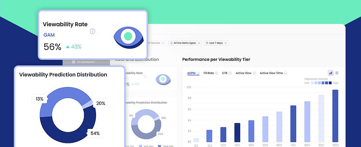
Your Brand New Viewability Dashboard!
Understand your inventory breakdown with the new Viewability Dashboard.
View Now -

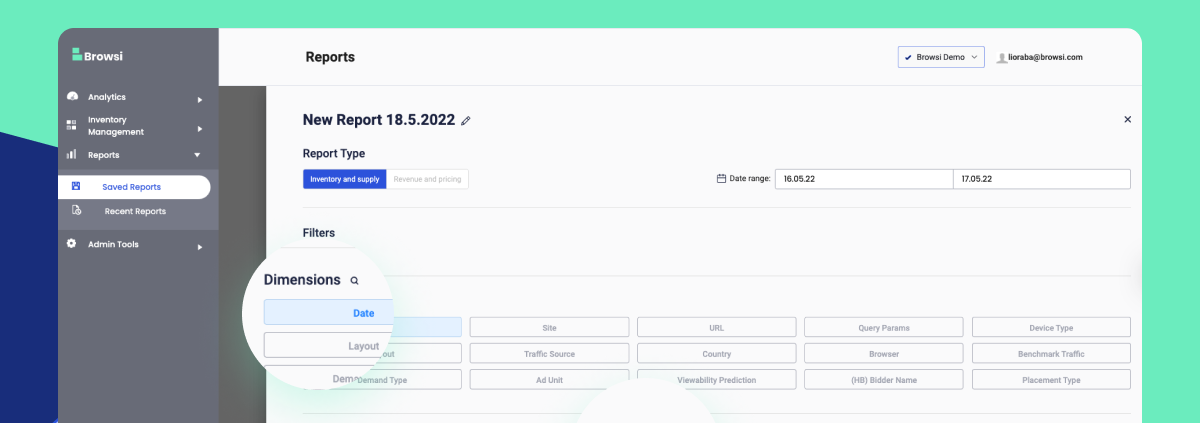
Maximize Your UX & Revenue Data With Personalized Reports
Ready to uncover insights and step up your ad layout strategy?
View Now
